I love infographics as they’re a great way to show, with images, what really happened. Especially with the real estate market it’s telling looking at median prices, versus averages along with rates of foreclosure coupled with other sources such as interest rates, loan to value, and other indicators. So I’m a nerd!
Anyways, Homeguide411 created a pretty sweet infographic about the housing crash that I’d like to share with you guys. Check it out, pretty cool stuff.
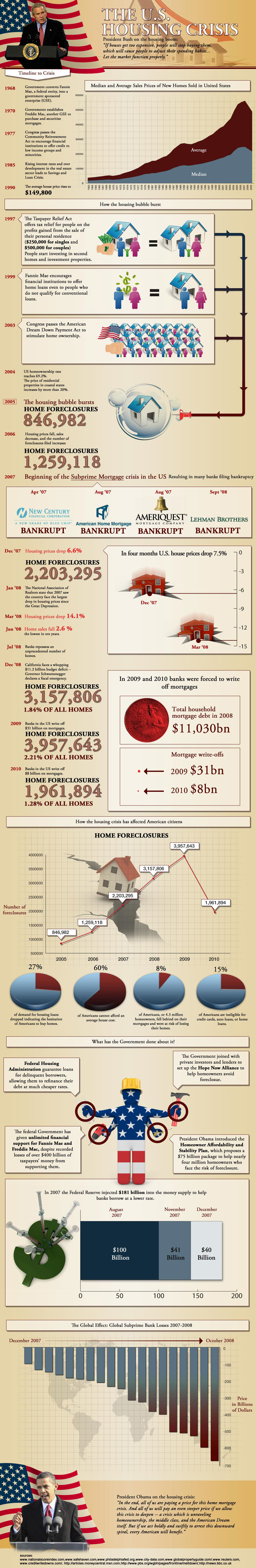
Infographic by: HomeGuide411.com


 blogarama.com
{ 1 comment… read it below or add one }
Thank you for being a nerd, a very smart nerd I might add. Very good information and the charts and grafs were so easy to understand.